Product UI/UX, quality and adoption guide
Dashboard and Admin-Panel UX Best Practices for Clearer Decisions and Safer Daily Work
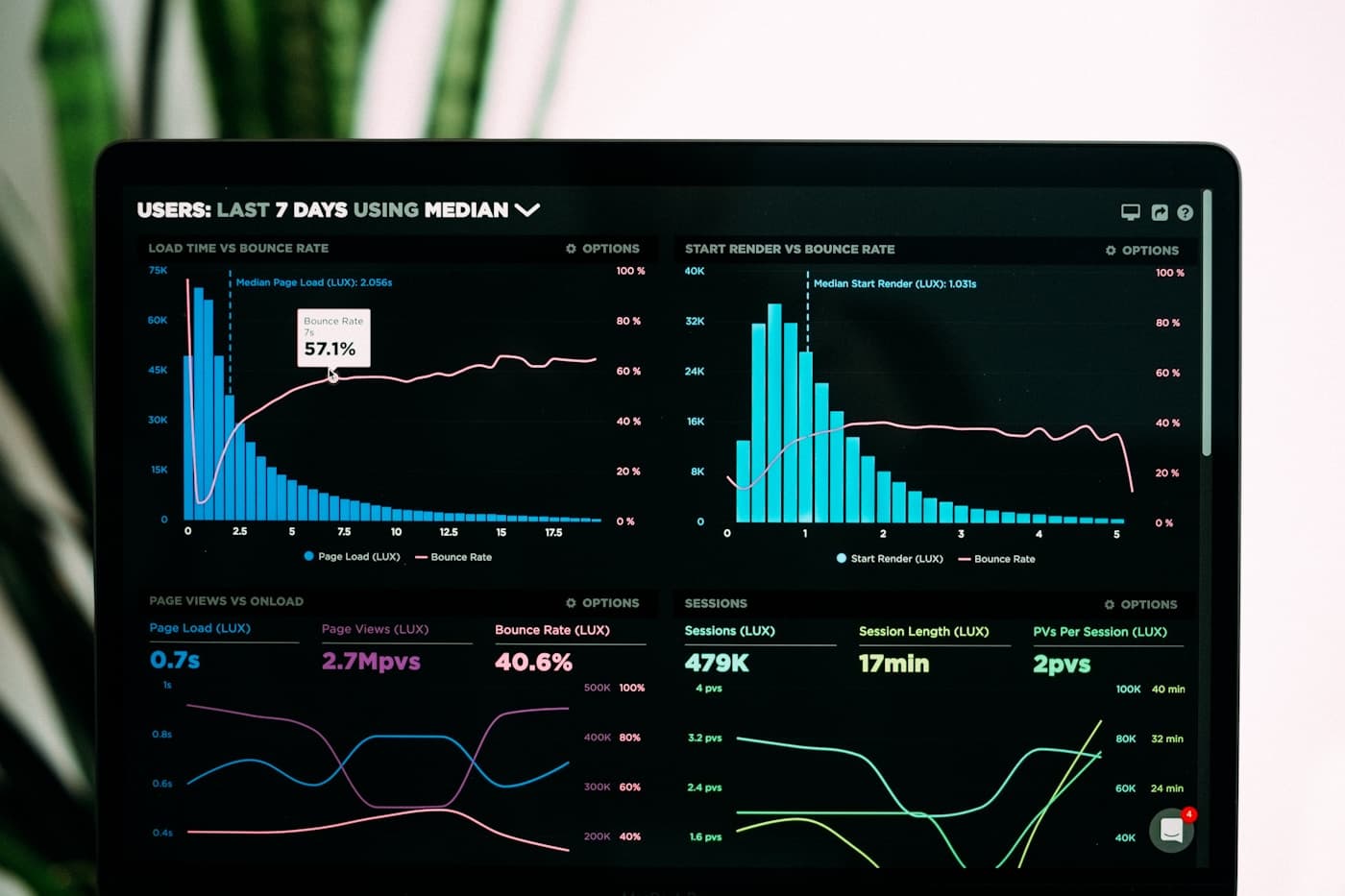
Design dashboards and admin panels around decisions, tables, filters, data confidence, approvals, permissions and high-frequency tasks.
On this page
A dashboard should help someone decide what needs attention; an admin panel should make important work easy to scan and safe to complete
Dashboards fail when they collect every available metric without a clear decision behind them. A useful dashboard names the audience, the questions they ask, the freshness of the data and the action a person can take after noticing a change or exception.
Admin panels have a different burden. They often handle lists, forms, filters, permissions, bulk actions, approvals and audit-sensitive changes. The design must protect accuracy and efficiency at the same time, especially for staff who repeat the work all day.
Good UX is visible in details: understandable labels, sensible defaults, persistent filters, clear status, useful empty states, readable tables, warning before risky actions, accessible keyboard behaviour and a record of what happened after a change.
When repeated screens and controls need a shared answer, use Design Systems for Scalable Software Products; existing dashboard friction can be prioritised through a UX Audit: What It Examines and Changes It Produces.
Use this guide when: A team is designing reporting, operational control, records management, approvals or administration for a web application, portal, CRM or ERP.
Applying this in a real project
A useful decision in this area starts with a real example, not a broad ambition. Choose a recent situation that represents the work described in this guide and trace it from the first request or trigger through the information used, the person responsible, the decision made, the handoff and the final outcome. This exposes the rules and exceptions that a short requirement or demonstration often hides.
Audience and decision: Define who uses each view, what they need to understand and which action or follow-up the screen should support. Data confidence: Show source, freshness, calculation context and status so people know whether a number or record is ready to act on. Treat these as evidence-gathering questions. Ask the people who perform the work to bring recent examples, including one that went wrong or required a workaround, so the proposed approach reflects the operating reality rather than the ideal process.
Table and filter behaviour: Design search, sorting, filtering, pagination, exports, saved views and bulk actions for the volume and frequency of real work. Control and audit: Set permissions, approval, confirmation, history and reversal patterns for changes that affect customers, money or operations. Write the agreed answer in a form that design, delivery, QA and business owners can use: the trigger, inputs, expected result, permissions, approvals, error or exception path, and the report or record that proves the work was completed correctly.
That level of clarity does not slow a project down. It gives the team a scenario to use in design review, implementation, testing, training and early support. It also makes later change easier because the business can explain why a rule exists, who owns it and what evidence shows whether the outcome has improved.
The choices that determine whether people can use and trust the result
01
Audience and decision
Define who uses each view, what they need to understand and which action or follow-up the screen should support.
Use one recently completed example to prove that the rule works with the information people actually have. Capture the starting point, the owner, the decision and the expected outcome so the team is not designing from memory.
02
Data confidence
Show source, freshness, calculation context and status so people know whether a number or record is ready to act on.
Make the handoff explicit. The next person should know what has changed, what they must check and how they can recognise that the work is ready for them. Unclear handoffs are where otherwise sound processes become delays and workarounds.
03
Table and filter behaviour
Design search, sorting, filtering, pagination, exports, saved views and bulk actions for the volume and frequency of real work.
Include the exceptions that happen in normal operations: missing information, a changed request, a delayed dependency, an incorrect record or an approval that cannot wait. A workable design gives people a safe route through those cases instead of forcing them outside the system.
04
Control and audit
Set permissions, approval, confirmation, history and reversal patterns for changes that affect customers, money or operations.
Agree how the business will review this after launch. A report, sample check, completion measure, support trend or manager review turns a stated requirement into something the team can improve from evidence.
Questions to settle before the team moves ahead
These decisions protect user confidence, delivery quality and the business value expected from the system.
| Area | What to define | Why it matters |
|---|---|---|
| Audience and decision | Define who uses each view, what they need to understand and which action or follow-up the screen should support. | It shapes usability, adoption, release confidence and the cost of future change. |
| Data confidence | Show source, freshness, calculation context and status so people know whether a number or record is ready to act on. | It shapes usability, adoption, release confidence and the cost of future change. |
| Table and filter behaviour | Design search, sorting, filtering, pagination, exports, saved views and bulk actions for the volume and frequency of real work. | It shapes usability, adoption, release confidence and the cost of future change. |
| Control and audit | Set permissions, approval, confirmation, history and reversal patterns for changes that affect customers, money or operations. | It shapes usability, adoption, release confidence and the cost of future change. |
How to design a usable dashboard or admin panel
01
Map the questions and tasks
List the decisions, records, exceptions and repeated actions each role must manage.
Keep the evidence from this stage visible to the people who will make the next decision. It avoids rediscovering the same facts during design, estimation or implementation and gives stakeholders a common reference point when priorities change.
02
Set information hierarchy
Place the highest-priority status, action and exception signals where users can scan them quickly without overwhelming the page.
Turn the agreed approach into concrete scenarios with realistic roles, data and timing. A scenario is more useful than a broad statement because it can be reviewed by users, built by delivery teams and checked by QA without interpretation being lost between groups.
03
Design interaction states
Define loading, empty, error, permission, success, confirmation and history behaviour alongside the normal view.
Do not prove only the best-case path. Include a delayed, incomplete, corrected or unusually urgent case so the team can decide what the product, process and support route should do when ordinary conditions are not available.
04
Test with real operating scenarios
Ask users to find an exception, complete a change, recover from an error and explain what the data means before release.
After the work is in use, compare the intended outcome with actual behaviour. User questions, completion quality, support patterns and operating reports show whether the change is holding up or needs a measured follow-up improvement.
Dashboard and admin-panel patterns that slow teams down
A wall of metrics
More charts rarely create more insight. Each metric needs a clear question, context and route to the next action.
The practical safeguard is to name an owner, document the expected behaviour and test a representative example before the risk reaches users or operations. That is usually less costly than discovering the gap during a live transaction or service moment.
Hiding frequent work behind clicks
Operational users should not repeatedly open deep menus to perform the normal actions that keep work moving.
Look for the informal workaround that people are likely to create when the designed route is unclear or slow. Workarounds are useful signals, but they can weaken data quality, auditability, service consistency and the ability to improve the process later.
Dangerous actions with weak feedback
Deletion, approval, access and financial changes need clear consequences, confirmation and history where appropriate.
Keep the risk visible after launch through support review, management reporting or a targeted quality check. A risk register should lead to a measurable operating control, not a warning that disappears once the release is approved.
Dashboard and admin-panel UX checklist
Use this to prepare the product, people and operating process before the next decision or release.
- Audience and key decisions defined.
- Metric source and freshness explained.
- Tables and filters tested with realistic data.
- High-frequency actions kept visible.
- Empty, loading and error states designed.
- Permissions and risky actions reviewed.
- Audit or history needs defined.
- Real operational scenarios tested.
Questions readers usually ask next
Should every user have the same dashboard?
Usually not. Roles need different levels of detail, permissions and actions. Shared definitions can remain consistent while the interface supports each person's work.
When should we use a table instead of cards?
Use tables when people need comparison, sorting, filtering and dense scanning across many records. Cards work better for a small number of distinct items or summaries.
Give people the information and controls they need for the next real decision
We can design dashboards, tables and admin workflows around operational clarity instead of decorative reporting.
Plan dashboard UXContinue reading
Product UI/UX, quality and adoption guide
Design Systems for Scalable Software Products
How to build a design system around real product repetition and delivery needs.
Read guide
Product UI/UX, quality and adoption guide
UX Audit: What It Examines and Changes It Produces
A practical guide to reviewing a product before redesign, rebuild or feature expansion.
Read guideRelated services
- Dashboard and Admin Panel UX
Design tables, filters, metrics, approvals and operational controls around the work people must perform.
- Design Systems
Create shared components, states and interaction rules that keep a growing product consistent.
- UX Audit
Find usability, workflow, form, navigation and conversion problems before a redesign or rebuild.